Darkroom NotesSeason 1STIL.Part 3 of 7
The film colours are made of my own obsessions — about the eight film looks
The film colours inside STIL. weren't chosen by market research. They're colours I actually love and have chased for years. The softness of Portra, the night of Cinestill, the 90s of VHS. Less a feature than a crystallisation of obsession — the third frame of the series is about the film looks.
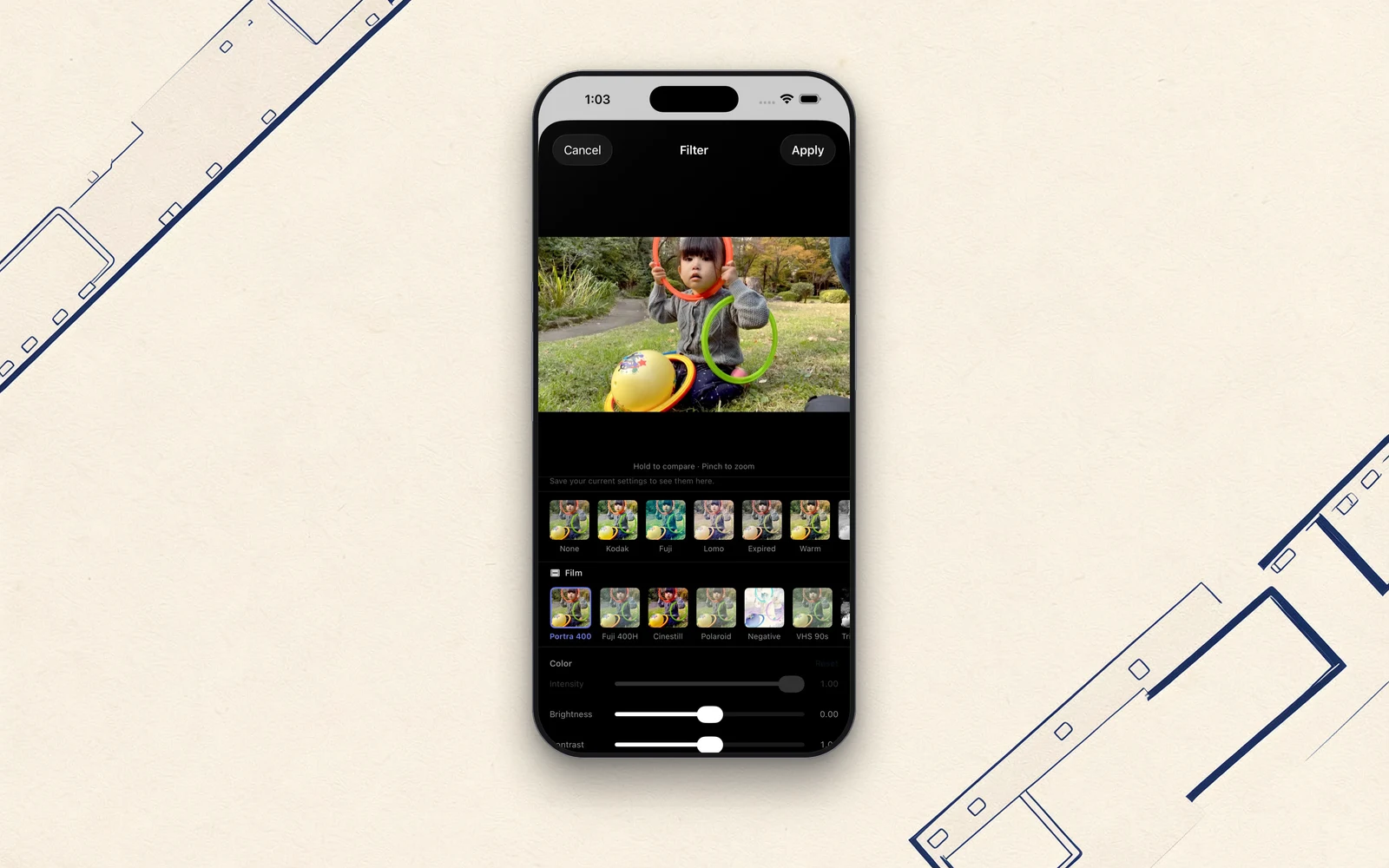
STIL. lets you lay film-like colour over the frame you've pulled from a video. You pick a look on export. Today is about that colour.
I'll confess: the film colours inside STIL. weren't decided by market research. They're the colours I actually love and have chased for years, dropped in as they are. Less a line on a feature list than a crystallisation of obsession.
Why "the colour of film"
I love cameras; I've used mirrorless bodies and instax alike. Digital captures things cleanly. But however high the resolution, there are moments it leaves me wanting — because accuracy and being moved are two different things.
Film has exactly that colour — not accurate, but moving. Skin tones that drift a little off, shadows that sink, light that blooms. As a record it may be imprecise, yet when you look back, the very air of that day comes back with it. I've always loved that feeling. So with STIL., rather than finishing a frame "correctly," I cared more about being able to lean it toward the colours of those days.
Eight looks
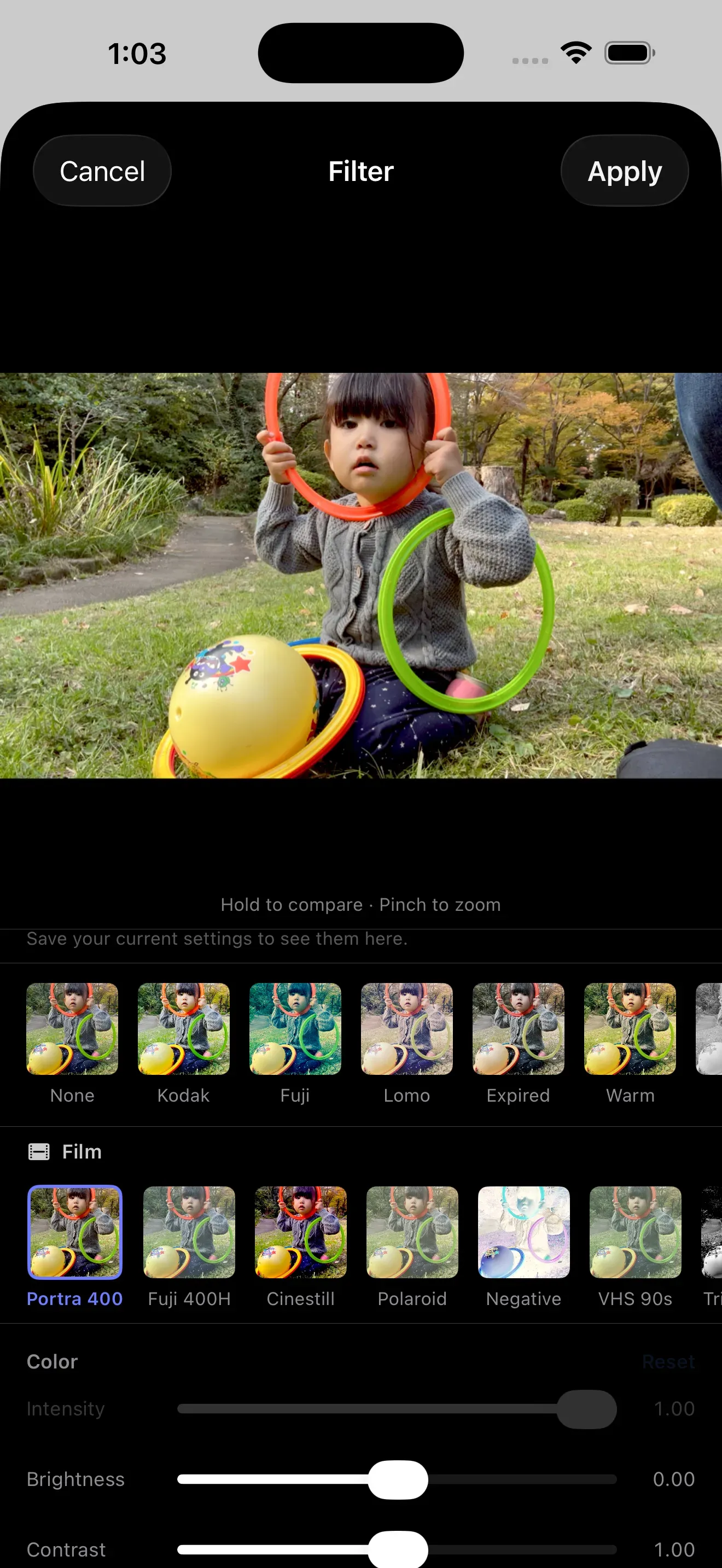
STIL. ships with eight film looks across free and Pro.
- Free: Kodak, Fujifilm, Lomo, Warm — starting from the familiar temperatures
- Pro: Portra 400, Fuji 400H, Cinestill, VHS 90s
Line them up and my taste shows so plainly it's a little embarrassing. The soft skin gradations of Portra 400, the greens and skies of Fuji 400H, the bleeding reds of a Cinestill night, and VHS 90s — that one isn't for image quality at all; it's purely for memory. The texture of those tapes I watched as a kid.
They aren't the real film stocks themselves. They're colours that evoke them. But I built each one by leaning on my own memory — "this is how the colour should come out" — nudging grain and contrast little by little.
Keep the original clean
One thing I was careful about in the design: the film colour is only laid on at export — it never touches the original frame. Even after applying a look, you can return to the bare image at any time.
"Non-destructive" is a plain bit of design, but it mattered to me. Film colour is something you pick by mood. Portra today; no, plain after all — so that you can waver over it again and again, the original frame always stays clean. Just like being able to reprint a shot many times in a darkroom.
Putting yourself into the tool
Features tend to come out looking similar no matter who builds them. But which colours you choose to include always reveals the maker's taste. The film looks in STIL. are that "taste" part.
I've only put in colours I genuinely love, so if the colours in STIL. feel right to you, it probably means you've taken a liking to my taste. It's a little embarrassing — but that, I think, is what it means to put yourself into a tool.
Next time, something a touch more technical: when you hand it a video, how does the iPhone decide "which frame is good"? I'll look inside.
You'll find STIL. at stil.photo, and the app on the App Store.